Pulse. A smart and minimalistic time tracker
Pulse.red is a powerful time tracker for those who appreciate simplicity. No pointless infographics; stay focused on the main things and track your project's time.
This is our venture project, made first and foremost to meet our needs. After several years of working with different time tracking solutions that are overloaded with integrations, billing modules and other bells and whistles to appeal to any audiences, we clearly visualized what’s bugging us and started building our own tool scratch.
- concept
- naming
- prototype
- ui design
- front-end
- development
- api
- os application
- research
- marketing
- venture
project timeline
the idea
At the heart of almost every project in our industry in the efficient management of budgets and financial constraints. However, not every company in our field takes it seriously enough—some choose to work with fixed budgets. Oh well, they’ll get there someday. :-)
The main expense is always the human working hour spent on a client’s project. So as a good manager, you should track the project’s vitals and have a clear view of how your team spent time working on different tasks. Our company is no exception, so we started using some great and well-known tools like Harvest and Toggl.
First thing was, how to get people accustomed to tracking their time during work.
This was no easy task, we even had to hang posters in the office, pointing the team to remember to track the time spent on projects. It came quickly with Toggl’s tray app, which notified users to track time. It also integrates with Basecamp where we keep all project workflow. So the tracking problem was solved, but we realized that managers cannot work with Toggl’s reports—they contain too much information on microtasking that cannot be compared with main project stages. Harvest deals with that, having a good structured project view with all estimates and reports. It’s a good tool for PM’s, but using and filling all those project forms was quite complicated.
So we had two custom audiences:
As a good manager, you should track the project’s vitals and have a clear view of how your team spent time working on different tasks.
 edgars francmanis
project lead
And we have to make a simple tool to satisfy both of them. We started working on prototype, and we named it Pulse.
the prototype
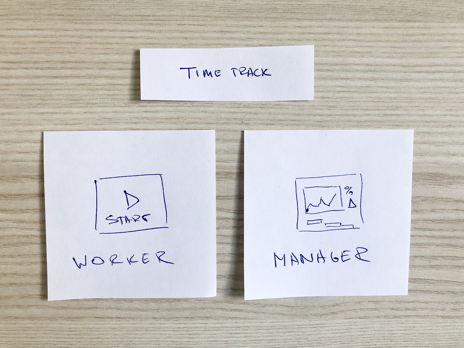
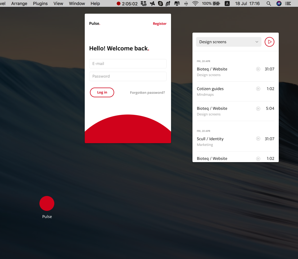
Unlike any other project, we didn’t have diagrams or mockups to start with. We came up with the idea of a very rough but functional prototype, one we could actually use and add functionality as needed. So we started with some paper notes:
We came up with the idea of a very rough but functional prototype, one we could actually use and add functionality as needed.
 karl plaude
design lead
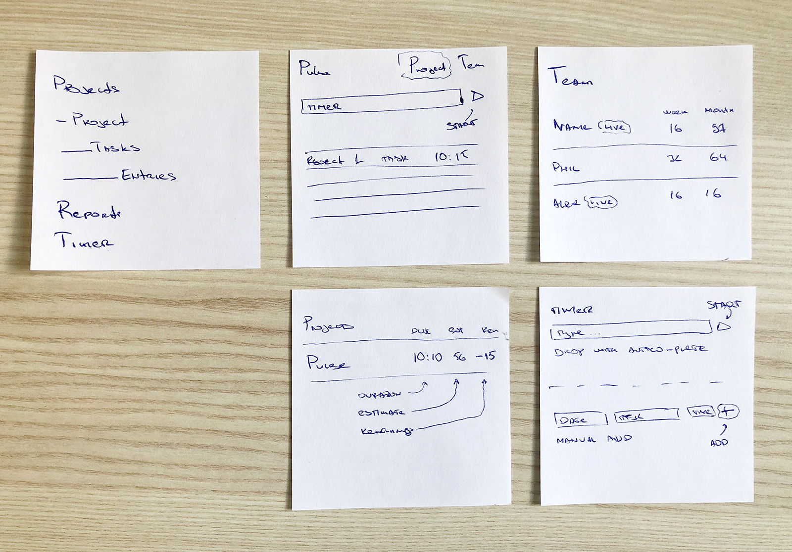
It took a week to make a working interface using Bootstrap elements and Symphony framework. It wasn’t too pretty, there was no user management or timer, but we could create projects and, and log time to them.

We started using it, ignoring the look, just focusing on functionality. As the team members got on board, more and more must-have features were needed, which we quickly implemented. The only major thing that we made no compromises on was User Experience. Using Pulse had to be very intuitive and simple. No manuals or tooltips. This we tested on our remote contract workers, sending them the link and a note instructing them to track their time using this tool. They had no questions.
ui design
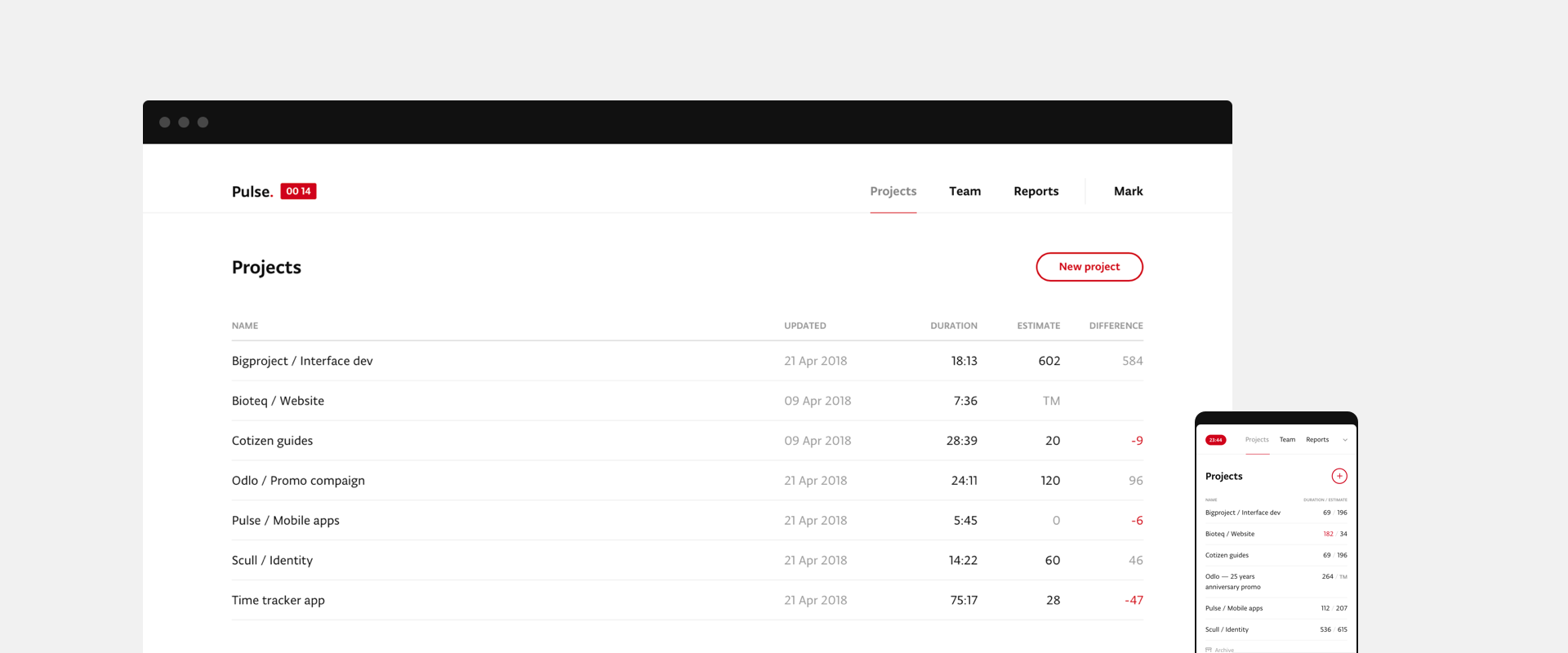
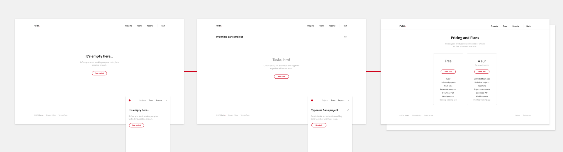
After a few months of using the Pulse prototype, we finally settled on a features list and moved to design process. We didn’t want to overload the interface with graphical elements, keeping it focused on the main things: a clear project overview, an easy-to-use timer, and transparent reports.

Working with fully functional prototypes helps us clearly understand that we need form UI.
We realized that we didn’t need any project charts or bars at all.
Showing the ETA and spent time in project lists made much more sense. Maybe someday we will change our minds and add some table graphs, but right now we are OK without them.
We’re also keeping in mind we might migrate to React framework and release mobile apps, but that wasn’t needed at the early stages.
The new design had to be fully adaptive, so it could be be easy accessible from any device.
karl plaude
design lead
the demo
So, we’ve been using Pulse in our company, why not make it public? Maybe we can earn some experience from other colleagues. But first, we needed to set up an open registration and a promo page, describing all the features of Pulse, which would require some time to get done. Meanwhile, we were very hungry for outside users’ feedback, so we created a small list of about 30 business contacts and sent them a short video with the demonstrations and personal registration link.
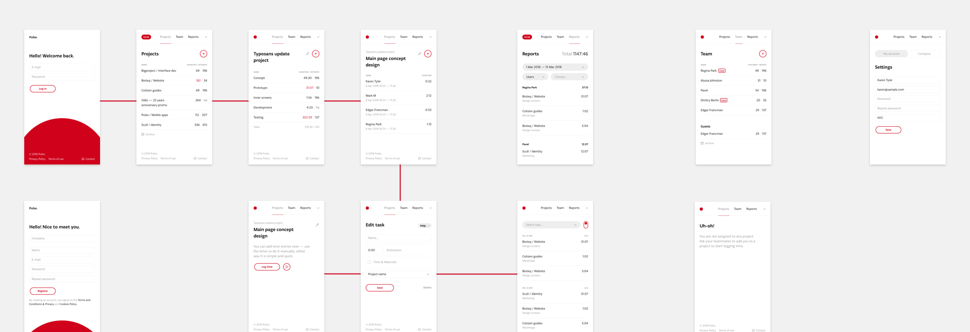
This was done in one evening. We quickly started to receive user feedback. Everyone noticed the clean design and clear structure. The tool was simple and users liked that. But there was also some negative feedback about onboarding. We realized that our team used the interface with prefilled content. Working with the prototype for several months, we quickly filled it projects and tasks. We just didn’t see the empty reports or project lists. We needed to make empty onboarding screens and took this seriously.
Meanwhile, designers came with the landing. The main thing, we didn’t really know who would use Pulse for time tracking: designers, developers or maybe lawyers or accountants? Time would tell. So we decided to full it with neutral content just informing visitors about the features.
Pulse.red has a great domain and a logo with a red dot, which we used in the landing page animation—the dot squeezes as you scroll down the page.
the launch
So everything was done and on April 28, 2018, we launched Pulse.red, posting the story on Producthunt, where all good tools have their homes. There we took #3 Product of the Day badge.

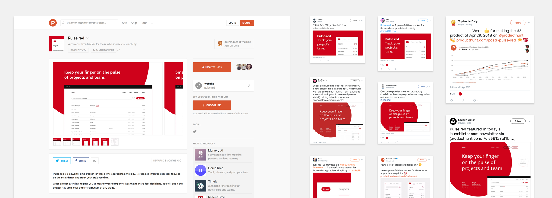
Users started to register from all over the world. We quickly gained feedback and reviews from other resources.

Maintenance
We launched without payment gateways, invoices, mailing lists or downloadable reports. Users had one month trial period to check out Pulse. After that they had to subscribe. Meanwhile, we were working to add all these functions, effectively making the trial period our deadline for implementation.
We created a public roadmap where our users could add features and vote for them. Stay tuned for updates.
Visit pulse.red

Get in touch with Fragment to discuss new business
hire fragmentSign up for our mailing list if you’d like to be notified on our projects and openings. No spam, promise!