Drafta. A place to keep your design projects
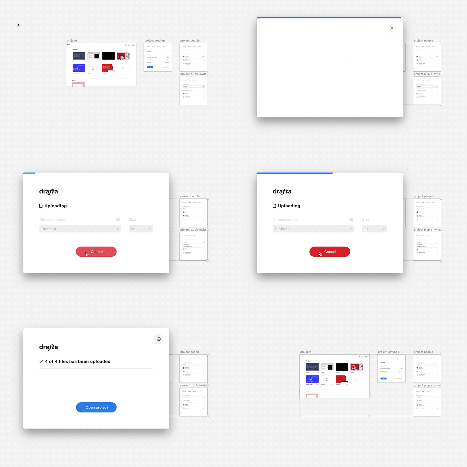
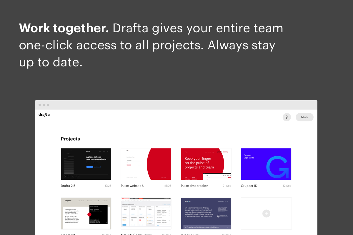
Drafta is a tool to keep track of project screens and share them with designers and clients. It is designed to be used by teams, providing one-click access to every project, complete with up-to-date design screens.
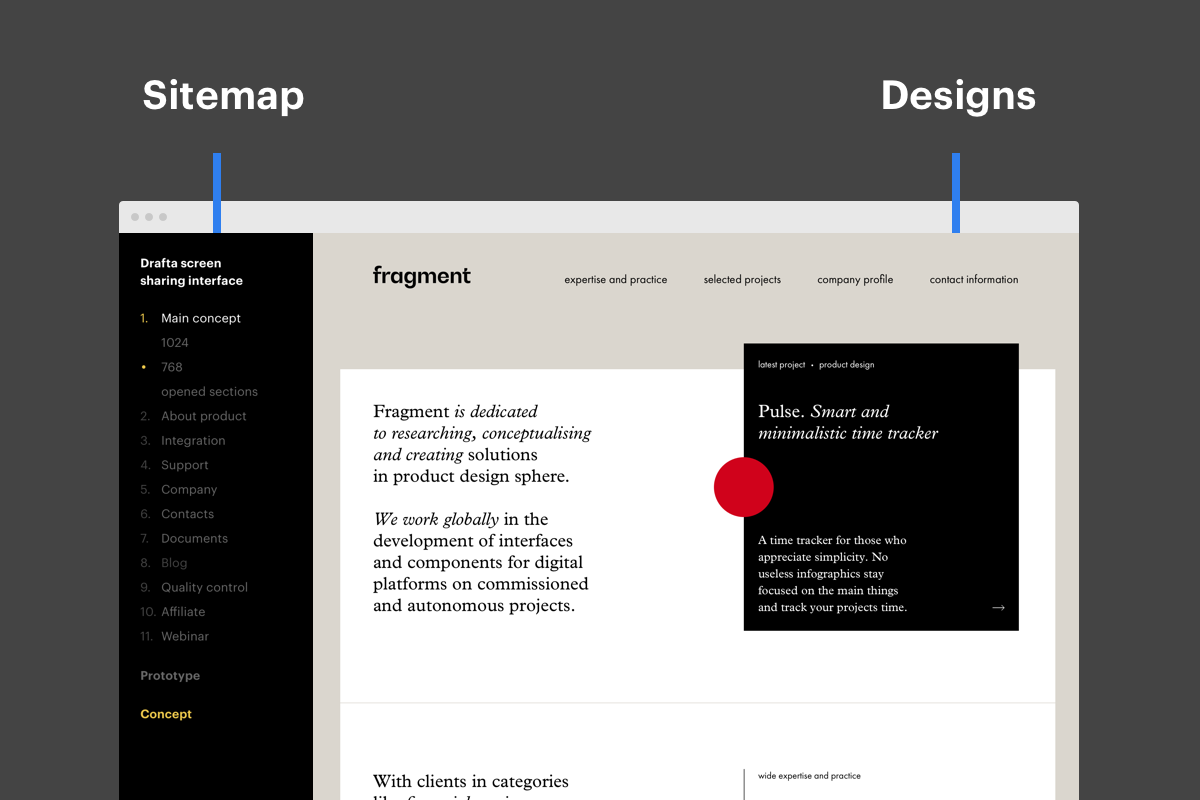
Drafta is built to fight clutter, allowing at-a-glance views of every project while keeping them structured and transparent. On the left, there is a sidebar featuring page names that serves as a sitemap. It makes navigation between screens easy, especially when you are working on a project with 70+ pages in different stages of completion.
- concept
- naming
- prototype
- ui design
- front-end
- development
- api
- plugins
- research
- marketing
- venture
project timeline
the idea
Ever since we started working in web design, we’ve been trying to come up with the best way to share our designs with clients. We’ve tried everything: sending screens over email, uploading to ftp, sharing access on Basecamp, and using specialized tools like Invision and Marvel. (These tend to give up on you once you reach a modest limit of 70+ designs with different screen states.)
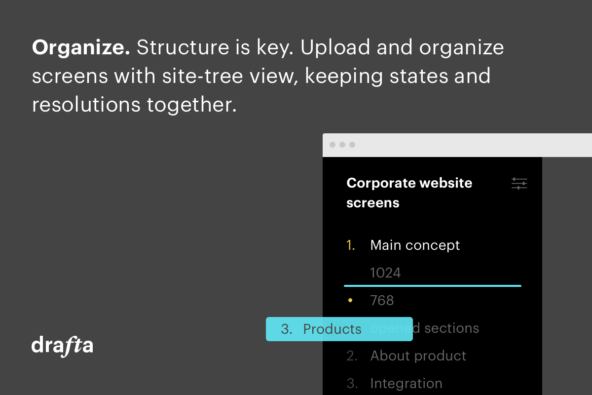
Soon enough it became clear: we need a place where we can upload web design screens and share them—with clients and among ourselves. Designs would need to be organised as a site-tree view, so we could easily find any screen by name.
We need a place where we can upload web design screens and share them—with clients and among ourselves.
 karl plaude
design lead
the prototype
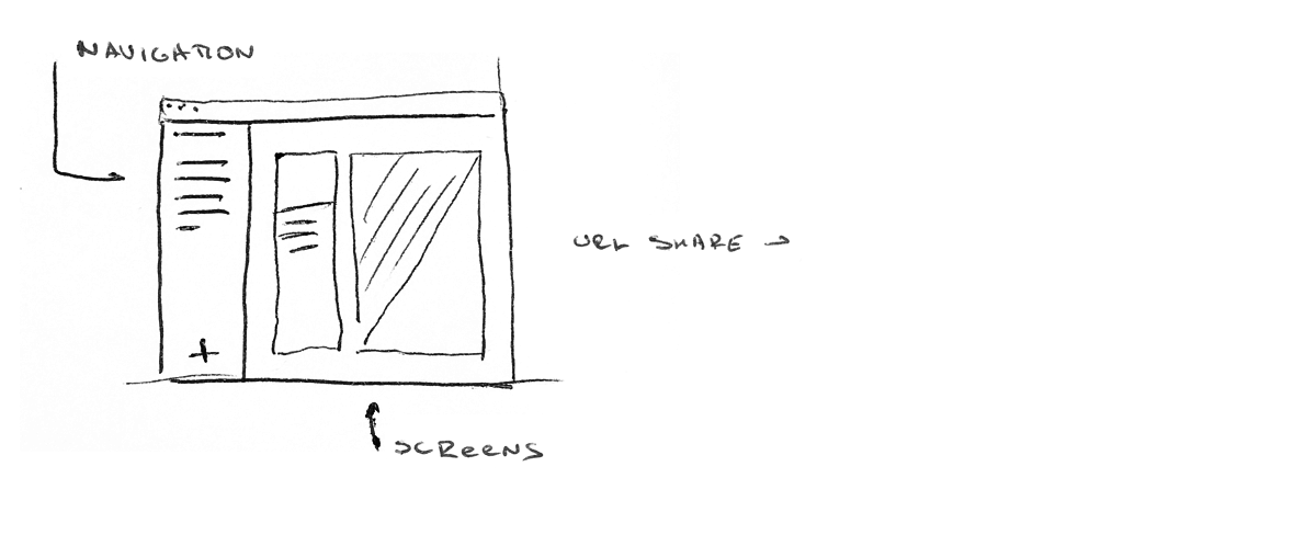
We started out by making a simple html page with a navigation sidebar—no registration or admin panels. Every screen got its own url address, so we could upload the screen to an ftp server and send the link to a client.
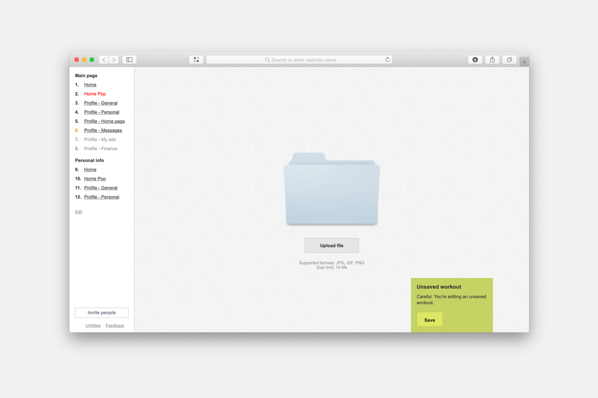
We kept the looks simple, too: there were no top bars, but we could set the background color to match the current screen. All screens were now in one place, leading many clients to point out good design flow.
Next came the prototype. After about two weeks, we had a simple bootstrapped MVP that focused on a few key features:
- An admin panel to create projects and upload screens;
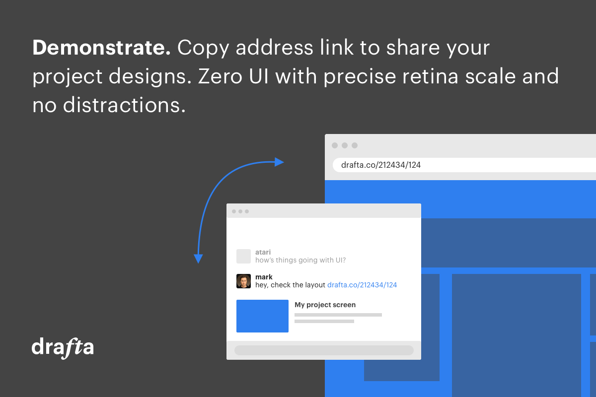
- A public view—no registrations, just a URL link;
- Screens organized as pages and groups;
- A hideable sidebar allowing to browse through the web screens without any distractions;
- Some viewing options: align screens, set background, scale retina designs to 100% browser view.
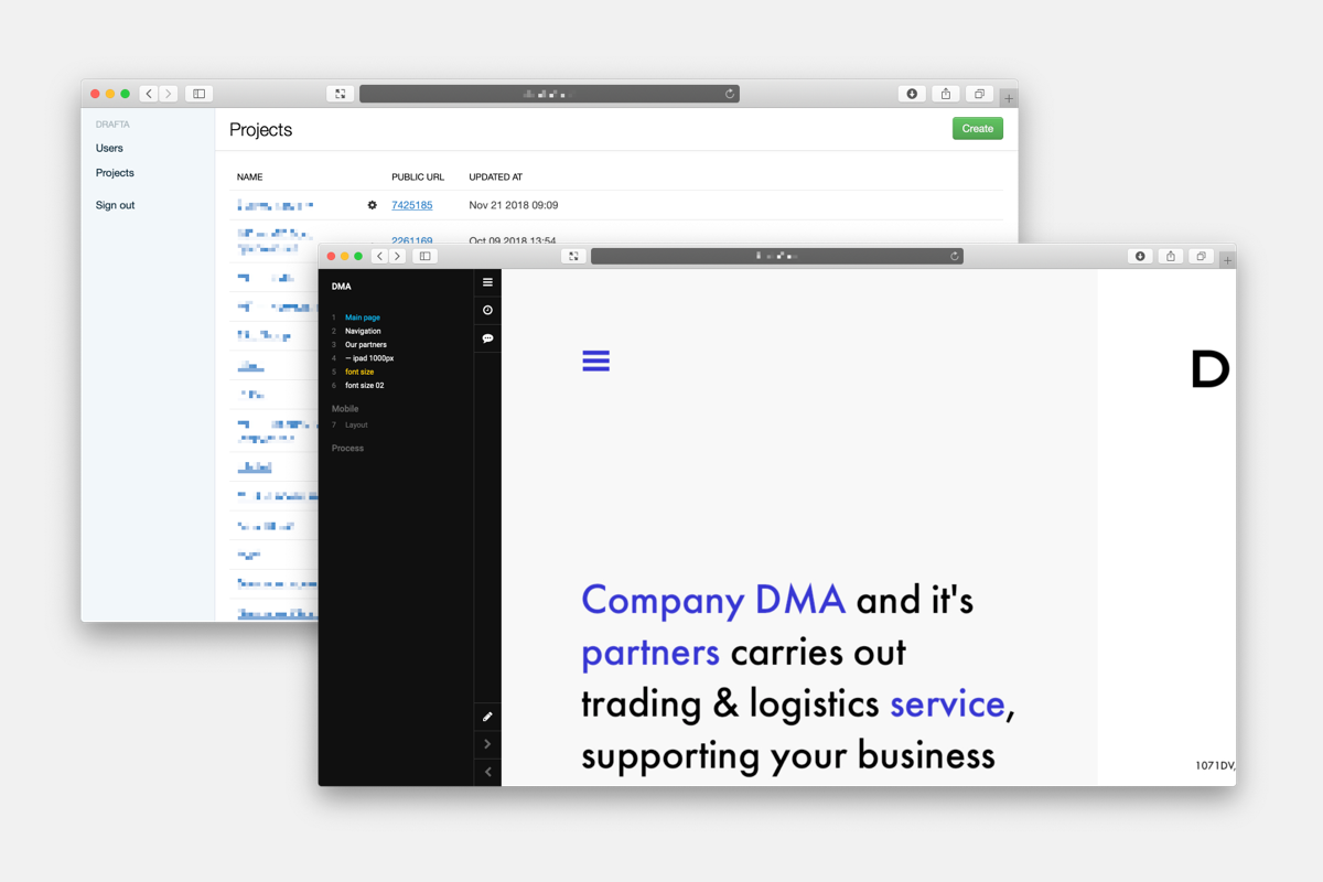
Later we added revisions, comments, Slack integration, and push notifications support.
We named it Drafta, and have used this prototype for 5 years!
ui design & development
In order to start accepting new team registrations we needed to make major changes in the prototype. Since the first version was made 5 years ago, we thought it would be better to move forward with brand new code.
While the developers were busy making their magic experimenting with React, the designer came in with some screens.
One of the challenges was to make the interface look the same for logged-in and guest users.
 vadim kukin
ui designer
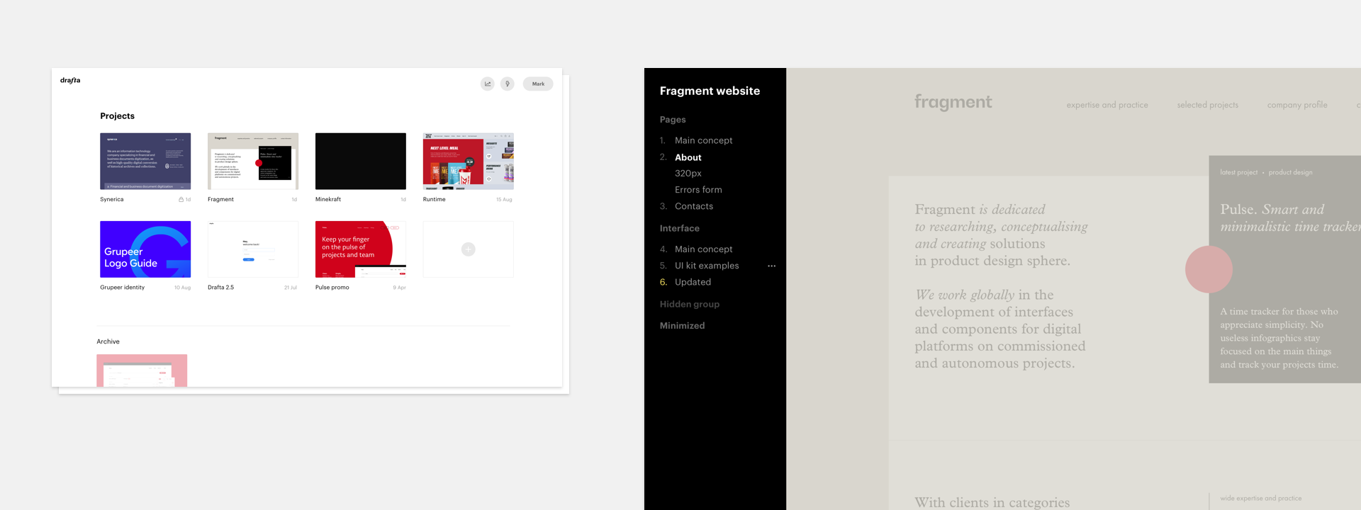
We needed to keep the design as minimal as possible. One of the challenges was to make the interface look the same for logged-in and guest users. Designers working with Drafta should have controls to add/modify pages, upload new screens and change project properties. We made the interface intuitive and accessible for first-time users by explaining each feather on hover.
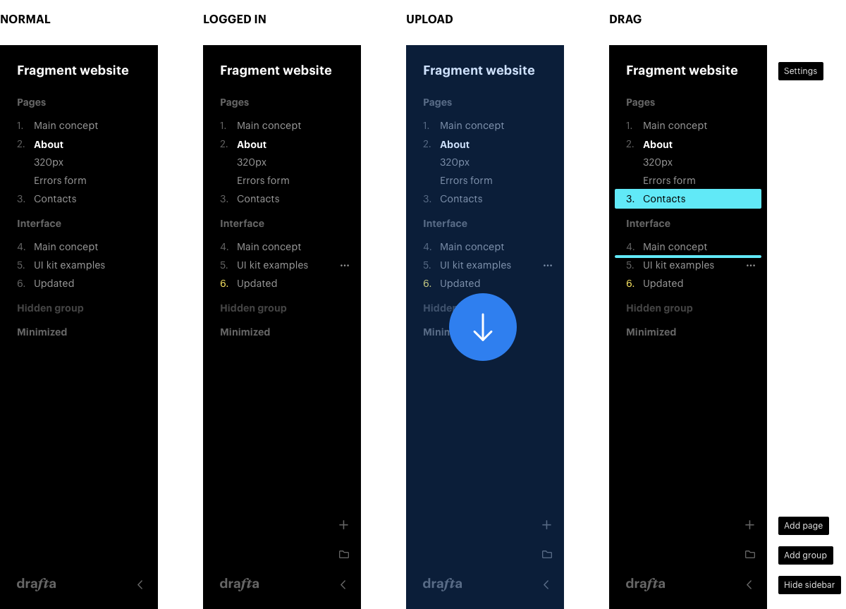
Another thing was to get rid of the admin section, where we organized pages and uploaded screens. All functionality must be accessible from a single view—the project interface. So the page list has to be draggable and users need to be able to bulk-upload files.
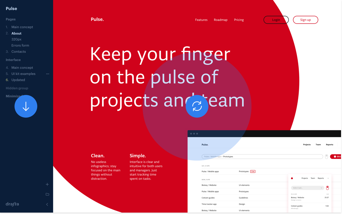
There are many tiny things that we were serious about. We were creating a tool for designers, our colleagues would use it, and this of course meant additional responsibility.
mobile-friendly view
One interesting use-case was to make desktop screens viewable on mobile phones. Then our clients or designers could use Drafta even while they’re away from their desk. In order to achieve this, we needed to make desktop screens zoomable, just like the pictures in Photos. Honestly, we have no idea why giants like Invison or Marvel didn’t think of that before we did. :)
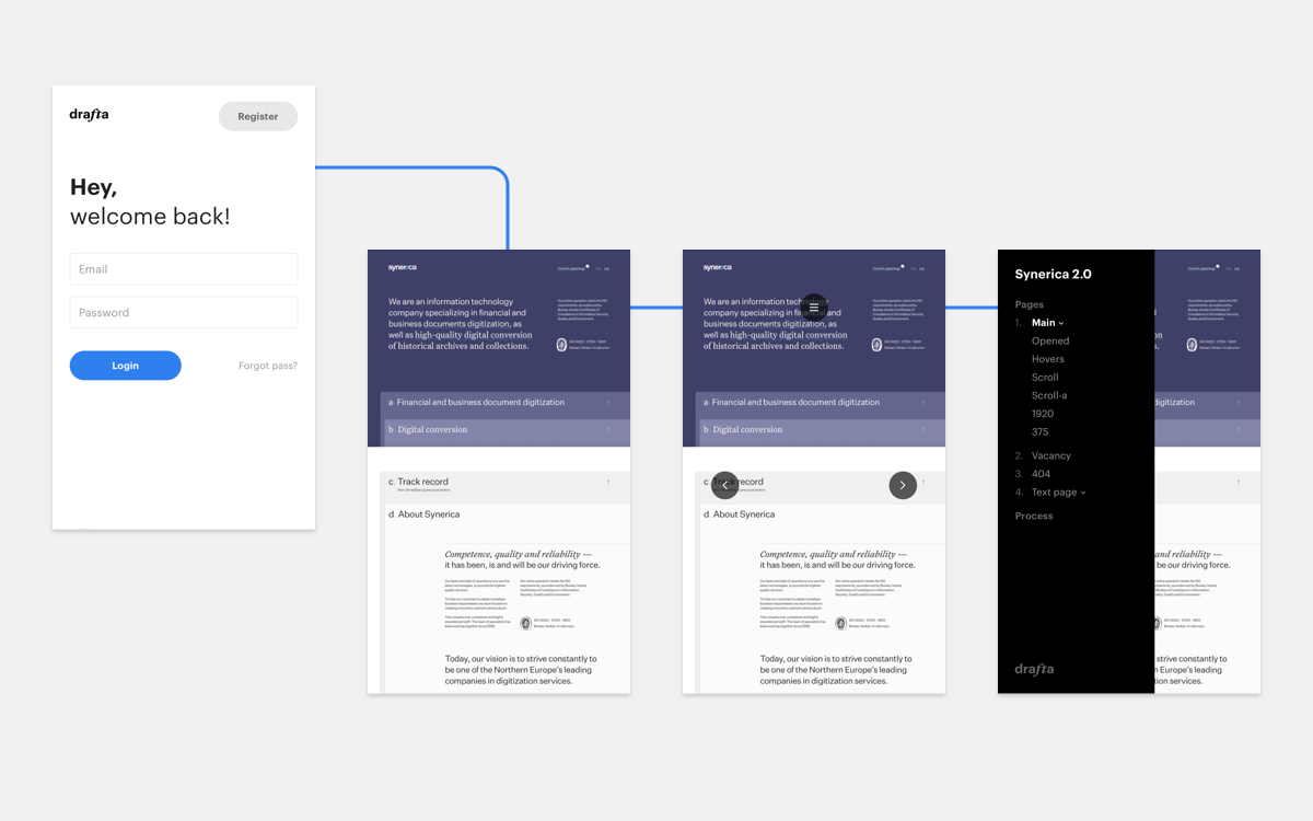
projects and activity
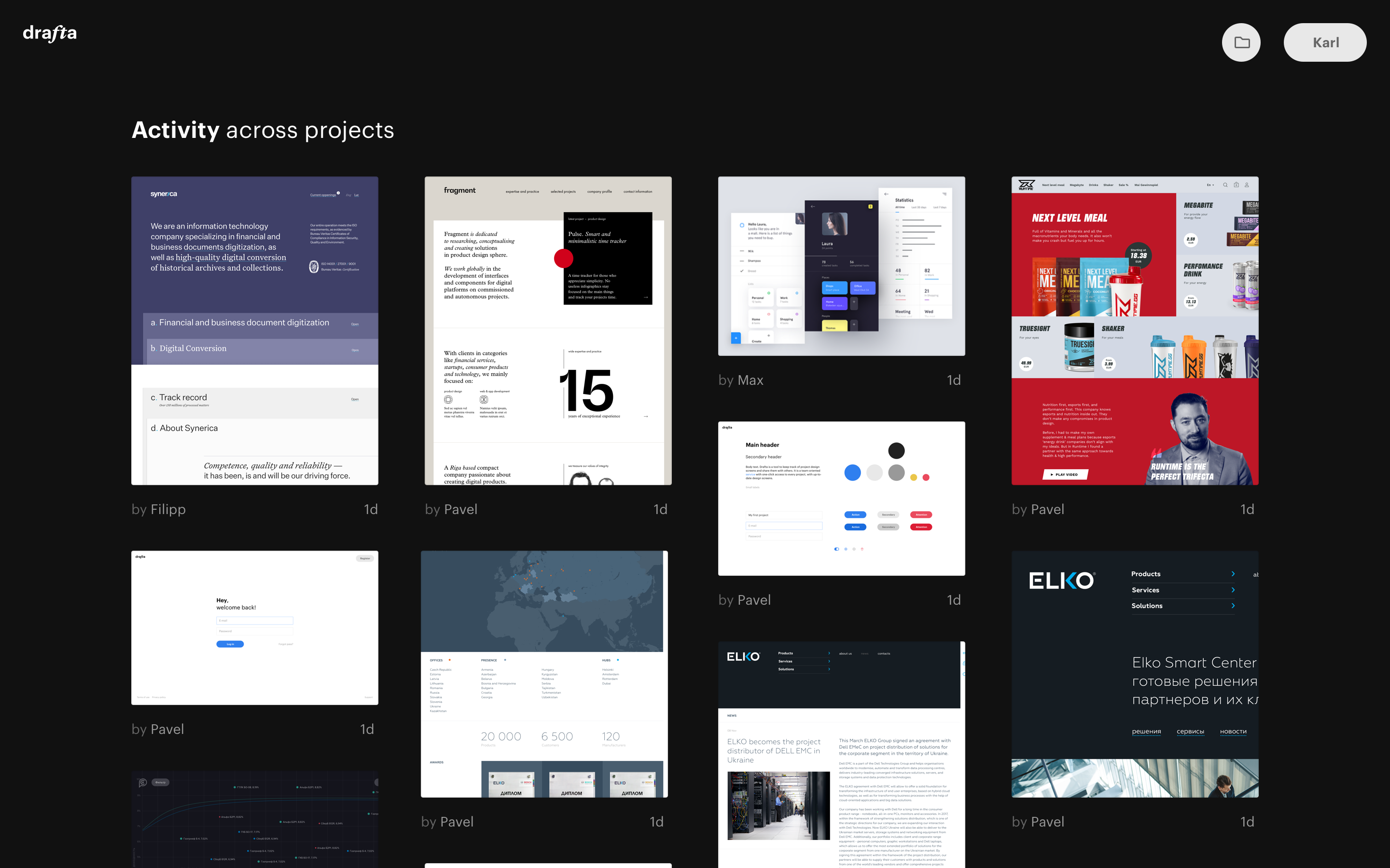
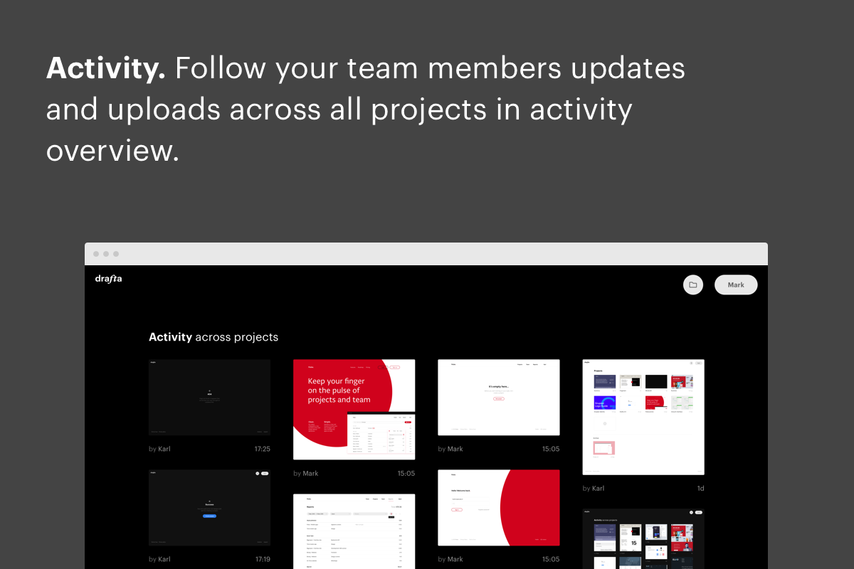
Another feature we badly needed was a page where we could track our company progress across projects. We decided to add a black showroom of updated screens, in case someone opened it on big wall-mounted TV to see what's going on across all projects at a glance.
Now everything was ready for launch. In the end of September, we tallied in the project expenses.
demo
If all those smart startup books are to be believed, you need to show your product to users as soon as possible in order to gather feedback. So before we even started designing the promo page, we put together a small video walkthrough and sent it out along with registration link to our fellow designers.
The whole operation was fairly low-key. Some designers were to busy to even respond, others didn’t quite see the need to switch from Invision. Many, however, praised Drafta for its clean interface and simplicity. And we also learned a simple link to a demo project drafta.co/1726574/79 can go a long way, better than any manuals or video tutorials. We made a note of it for the future!
preparing for launch
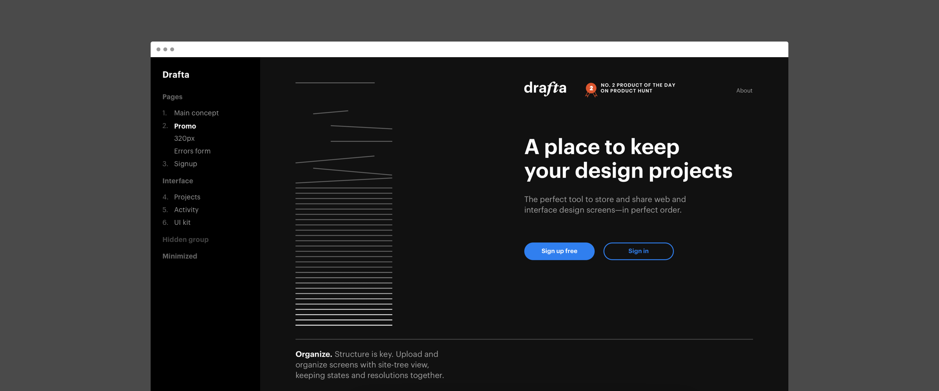
After successfully launching Pulse.red, we already had a pretty good idea how to proceed. Step one was to design a promo page that would set the tone, visually, for all other promotional elements.
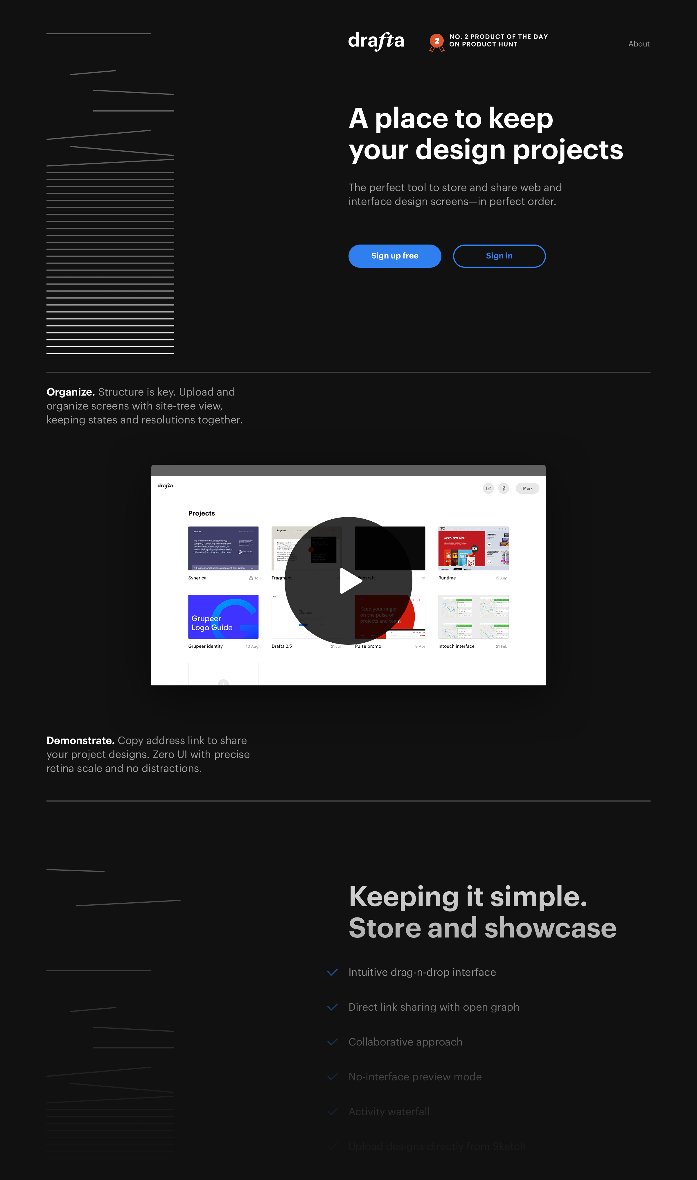
Our first users loved the elegance and simplicity of the black sidebar, so we kept the black color scheme and contrast elements for the promo page.
We visualised Drafta workflow process as elegant animated lines falling down and stacking neatly on the screen.
This element serves as an eye-catcher for web surfers—and motivates to scroll down to see more :)
While designing the promo we also created screens and texts for promoting Drafta on popular startup websites.
launch
When everything was done, and Drafta.co was tested and running, it was time to prepare for H-Hour—the launch on Producthunt.
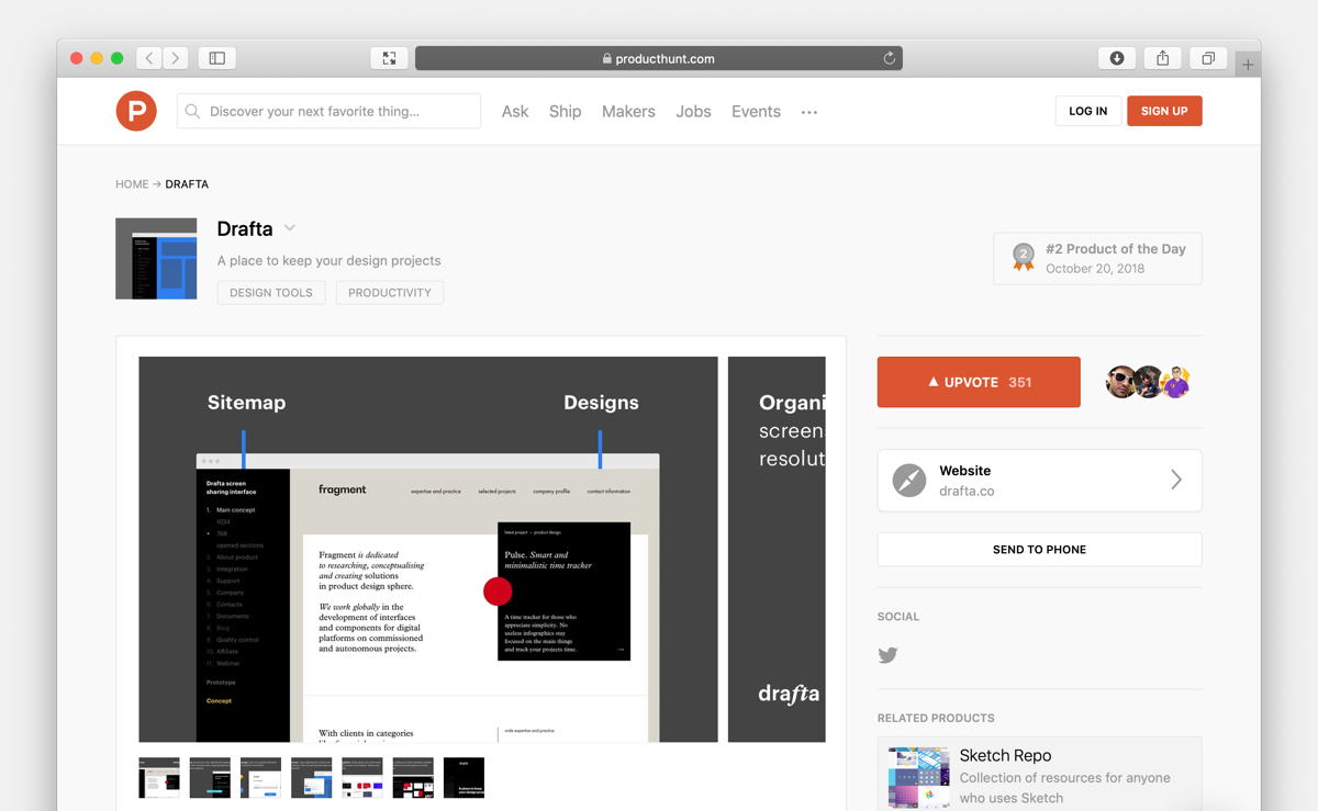
On October 20, 2018 we started to receive our first independent users and climb to the top of the day on Producthunt. People started tweeting about Drafta, and we were got a few shoutouts on several IT blogs and outlets. By the end of the day we received #2 App of the day badge.
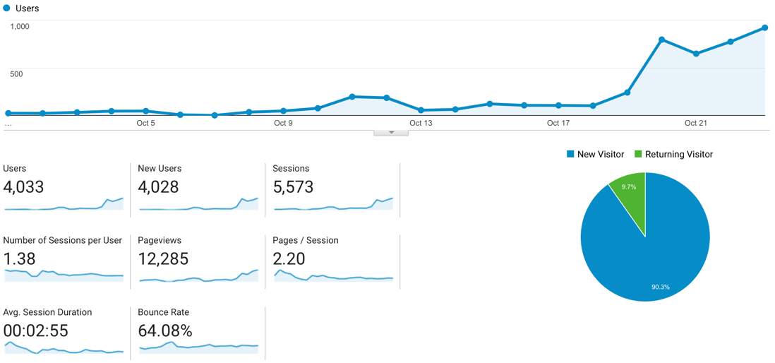
The launch gave us 250 new users, this number doubled by the end of the month.
maintenance & support
Like we did with our previous project, Pulse.red, we launched Drafta with just the bare minimum of features. While in beta it is completely free to use. We expect our pricing plans to depend on how many projects a user has. Our motto stays the same:
Launch a soon as possible, keep it minimal and invest in quality.
We have a roadmap for future features that is published on the promo page, which we can tweak according to our users’ needs.
sketch plugin
The first such add-on was a Sketch plugin for Drafta—since that’s what so many designers choose to do their work. We sent an email to the Sketch team not hoping for anything huge, but to our surprise, they decided to include Drafta to the Featured integrations list among Zeplin, Marvel and Invision. This was indeed very inspiring and gave us a huge motivation to move on.
Visit Drafta.co
Get in touch with Fragment to discuss new business
hire fragmentSign up for our mailing list if you’d like to be notified on our projects and openings. No spam, promise!

