Octopus. Create visual sitemaps and estimate project costs
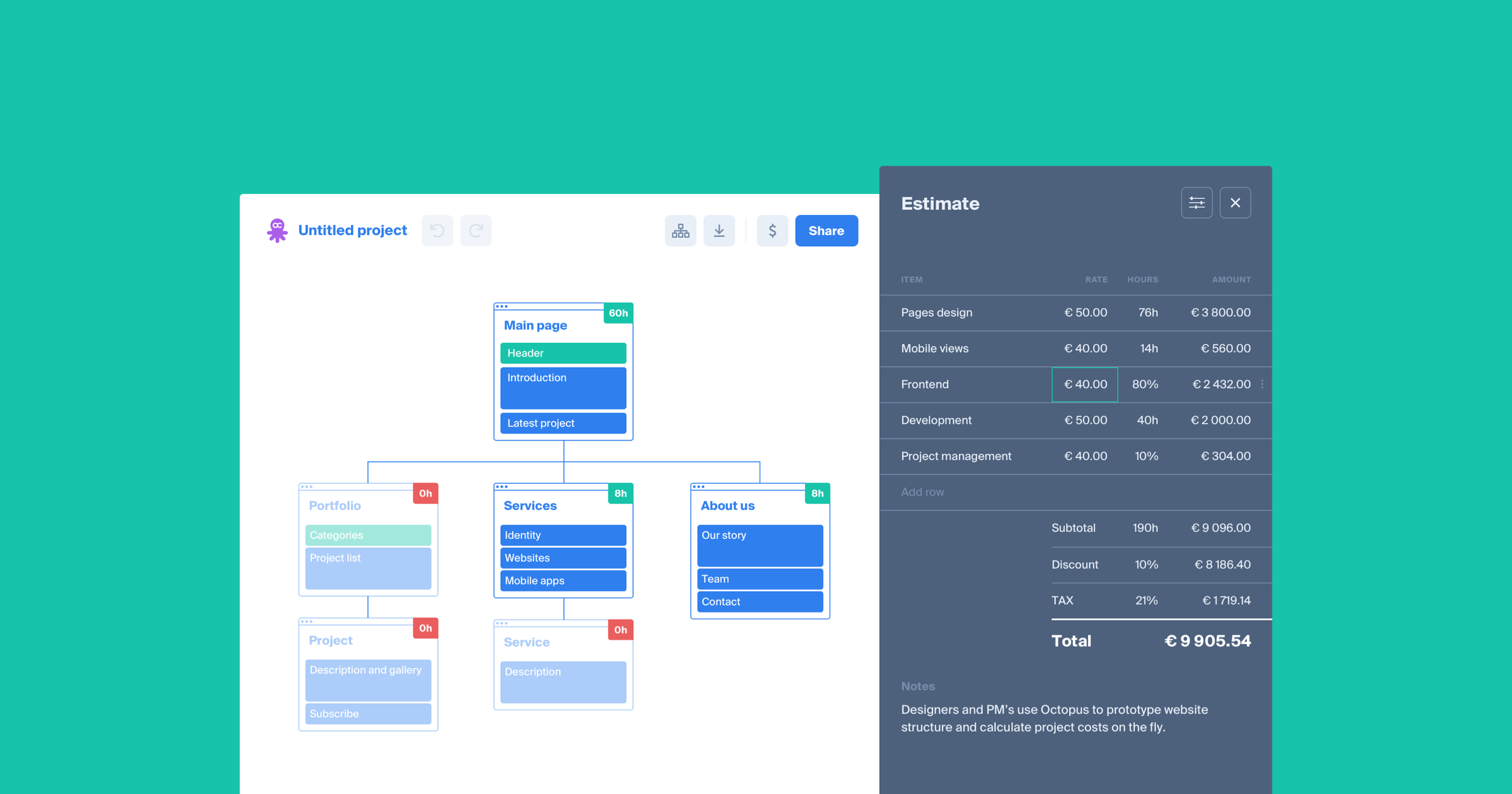
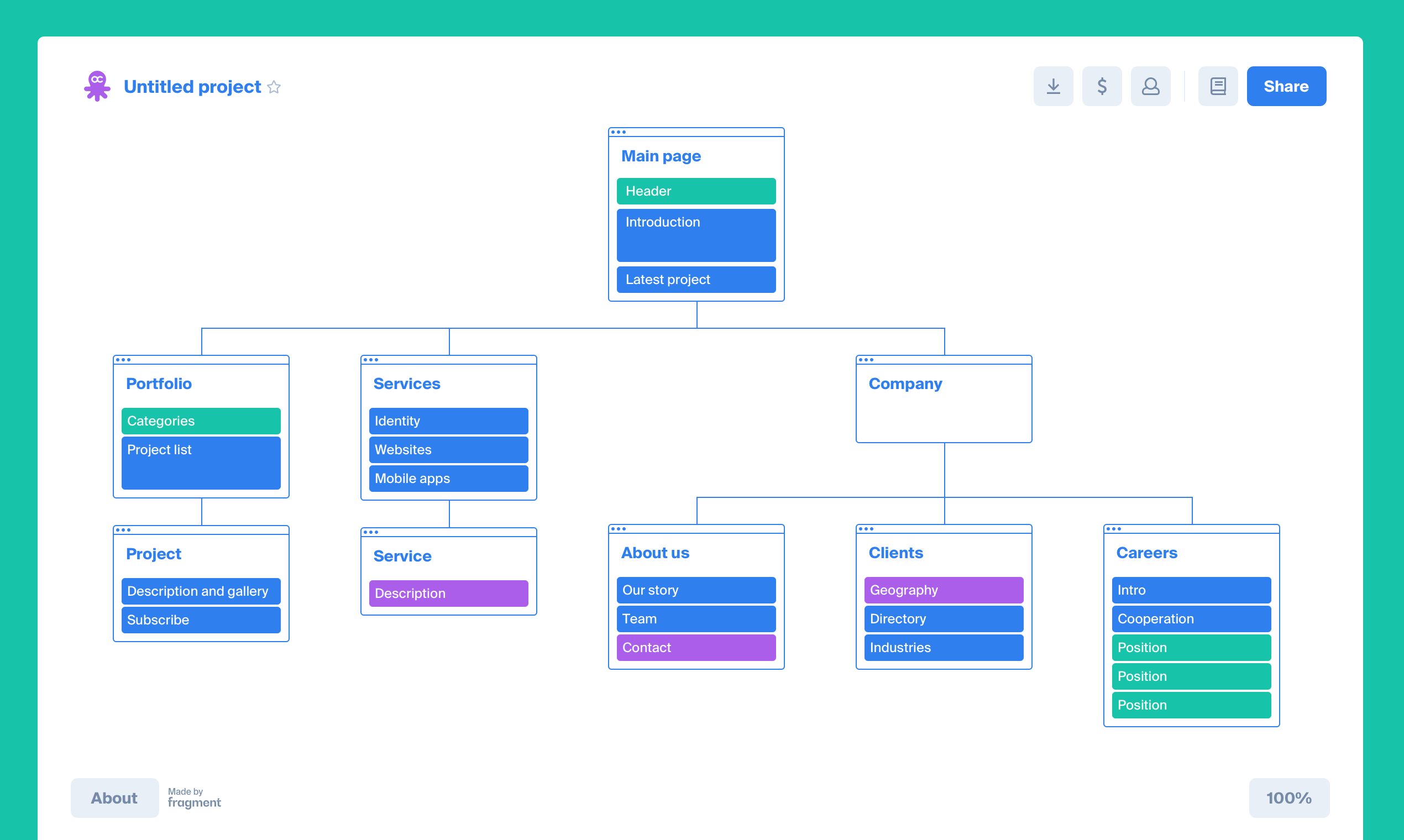
Octopus is a visual sitemap building tool with a built-in costs calculator. With Octopus, designers and project managers prototype the structure of websites and mobile apps and map out the content of the pages.
For each page, they estimate the costs to design and develop the product. It’s easy to share Octopus projects with clients. One just sends over a sharing link.
- concept
- naming
- prototype
- analysis
- ui-design
- front-end
- development
- api
- marketing
- venture
project timeline
the idea
Project evaluation is tedious. It takes up many man-hours of highly-trained professionals — the time that could be spent on the real work. At Fragment, to optimize the evaluation process, we’ve broken it down into 4 stages:
- Project analysis
- Visual sitemap creation
- Time estimation
- Creating a report and sending to the client
Doing the project analysis, we sort out the content of a future website or an app and organize it.
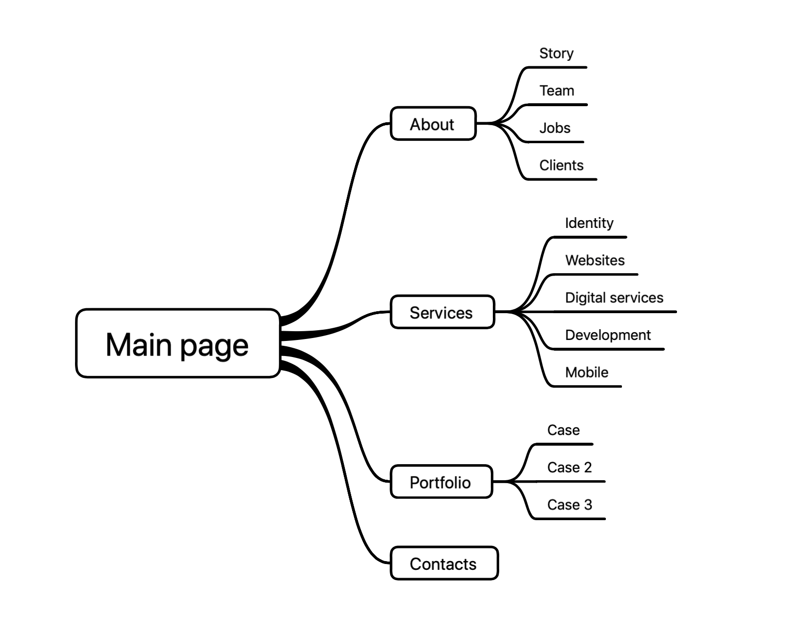
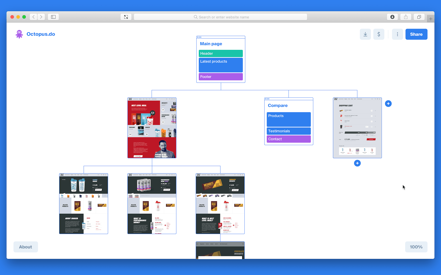
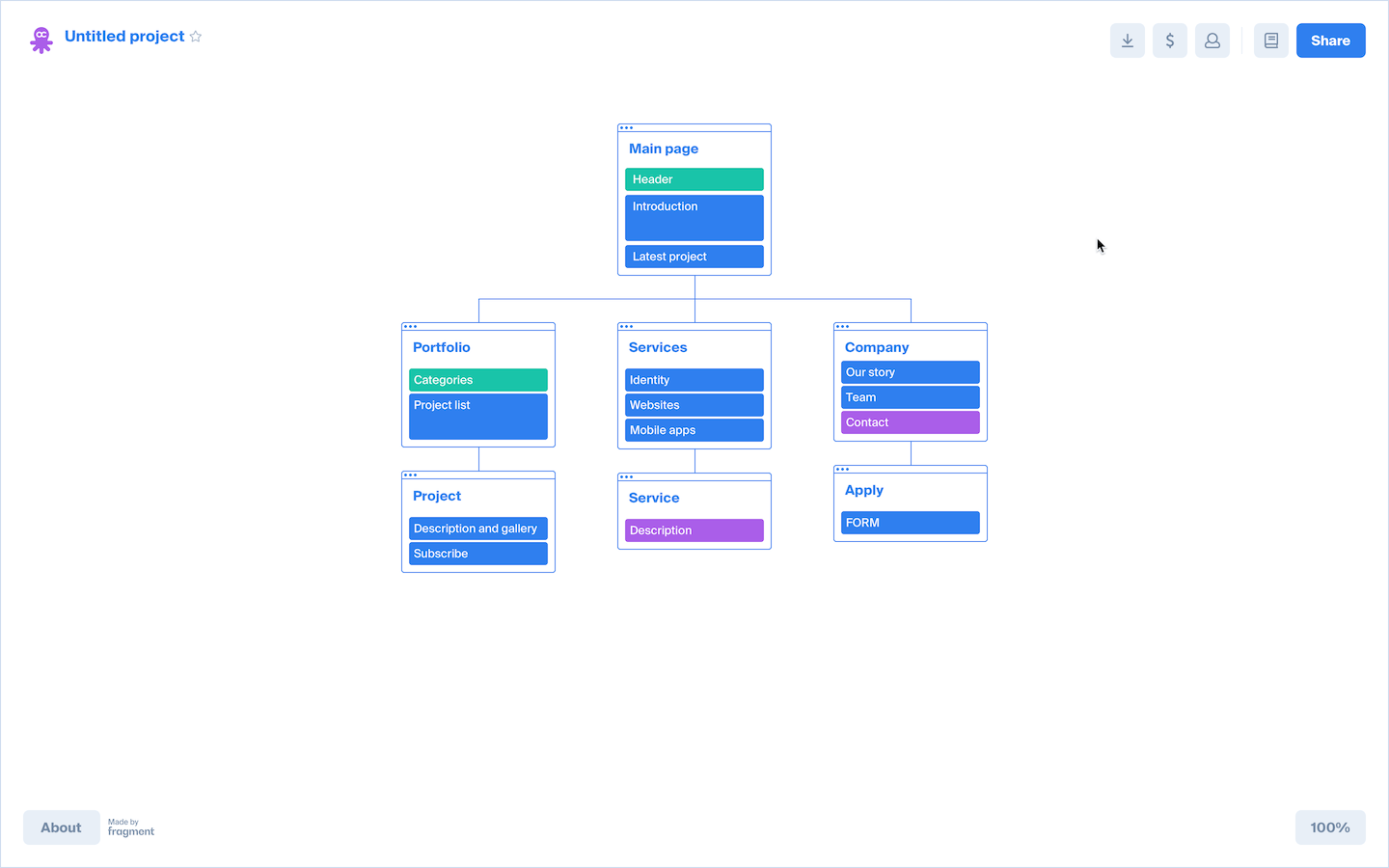
Then we create a sitemap. Before Octopus, we used to write on sheets of paper, listing the functions of each screen and grouping the screens accordingly. At this stage, we estimate the number of screens and logical connections between them.
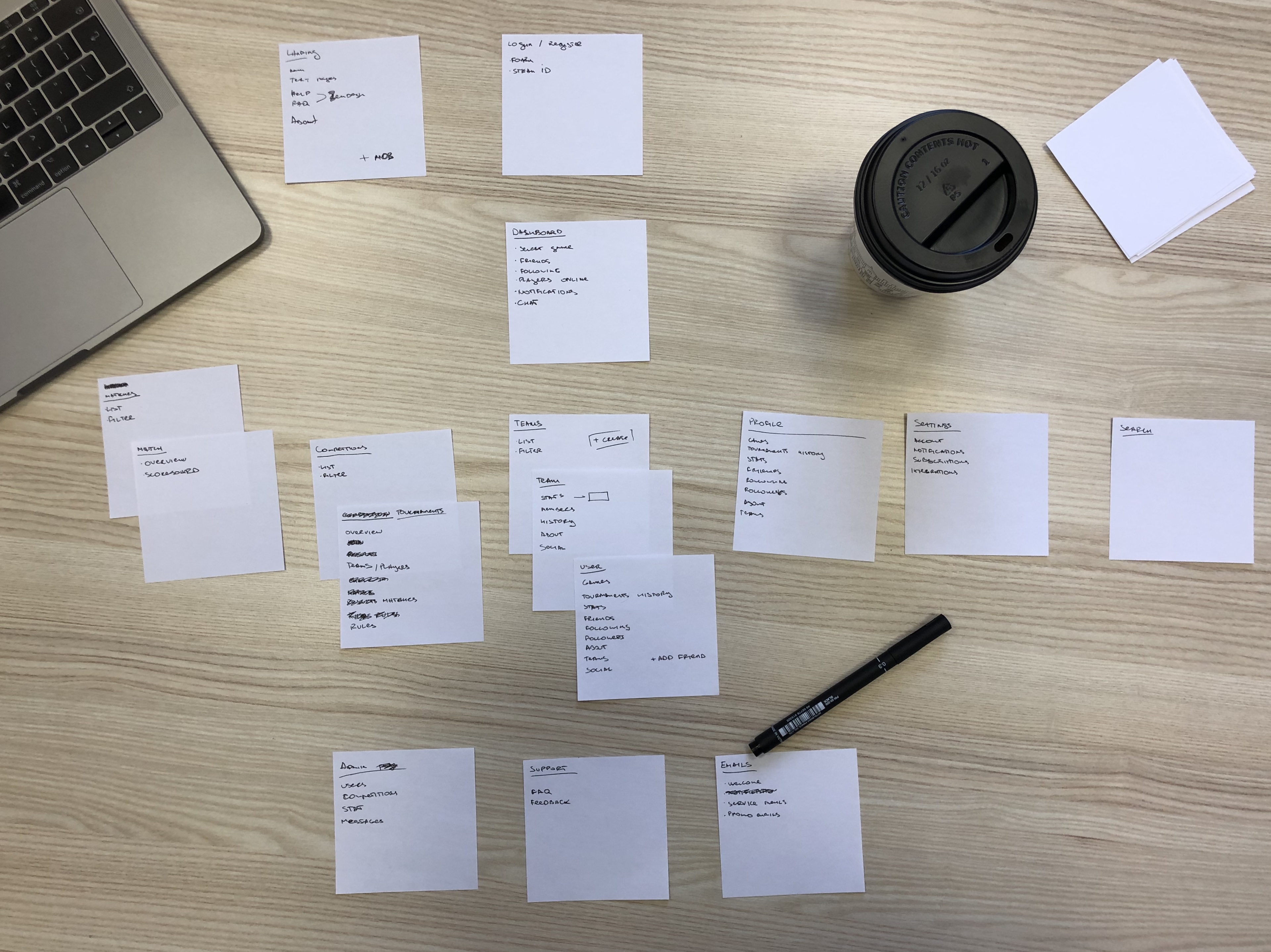
Each sheet represented a website screen. Each bullet point represented a separate block of information on each page.
Before Octopus, once the project’s structure was clear, we had to lay it out in Sketch to make the ideas shareable with the team and the client.
 edgars francmanis
project lead
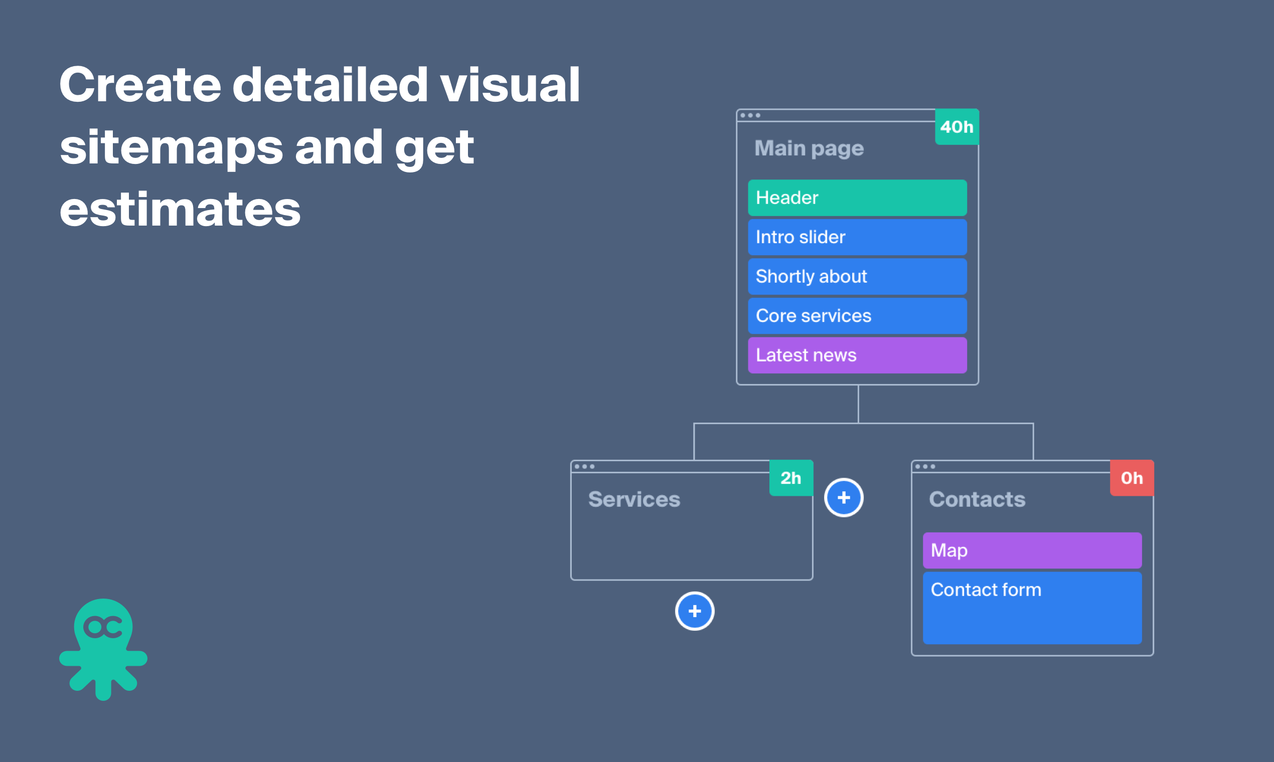
Next, we estimate the time needed to design each page. The front end and the back-end development, as well as other work, is then factored in.
We look at the designers’ work as a point of reference to project other costs. From our experience, the front end development usually takes 90-110% of the time spent on the design.
Finally, the project’s visual sitemap and the cost estimate have to be merged some document to share with the client.
The project evaluation used to take up about two days. That’s a lot of time! So we decided to create a tool that would simplify this process.
research
First of all, we did some market analysis. About 80% of users create sitemaps using mind map tools: Xmind, Mindmeister, Lucidchart, etc.
They let you quickly create a structure of pages, connect them with links and even colour the blocks.
But it’s not enough to build an accurate sitemap — one can’t create content blocks or sections inside pages.
 karl plaude
design lead
So some users turn to special visual sitemap services like Gloomaps, Slickplan or Writemaps. These services were made to prototype website sitemaps instead of mindmapping. We can point out Flowmapp. There one can create a visual sitemap and choose page icons from their library.
But neither of these services lets you map out the content blocks inside each page. The closest thing they offer are pictograms to arrange but using these, one simply can’t lay down enough content details to make an informative and reliable visual sitemap.
As for the estimated costs, there are many invoicing tools, but they are not cut out for predicting costs and they are unwieldy. So most people use Google Spreadsheets or Excel-like tools to carry out the calculations.
We did not find any services that would have both the detailed site mapping and the costs prediction features, so we went on to develop our own service.
the prototype
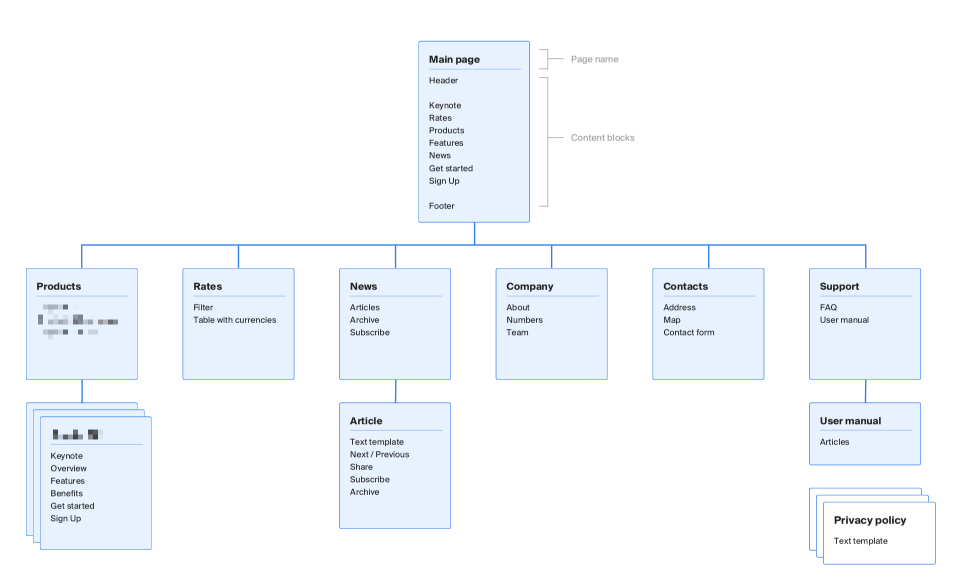
We made the UI of Octopus quite simple. It consists of a general layout where the user creates his visual sitemap and an estimate panel to calculate hours and project expenses.
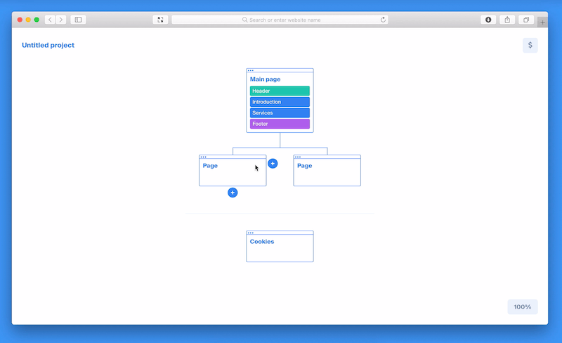
The user interface consists of only two screens as we’ve been focusing on accessibility and transparency.
karl plaude
design lead
We used React to quickly make a fully functional front end prototype. Before making any further steps, we decided to reach out to the potential customers and gather some feedback.
first impressions
Working on the previous products, we collected our first feedback only from our friends and clients. We got thoughts on the subject, but not actual leads. This time, we tried going bigger — and it worked out well.
We spread the word about Octopus via Facebook groups for UI designers, developers, and project managers. We made a short video and pushed a few posts.
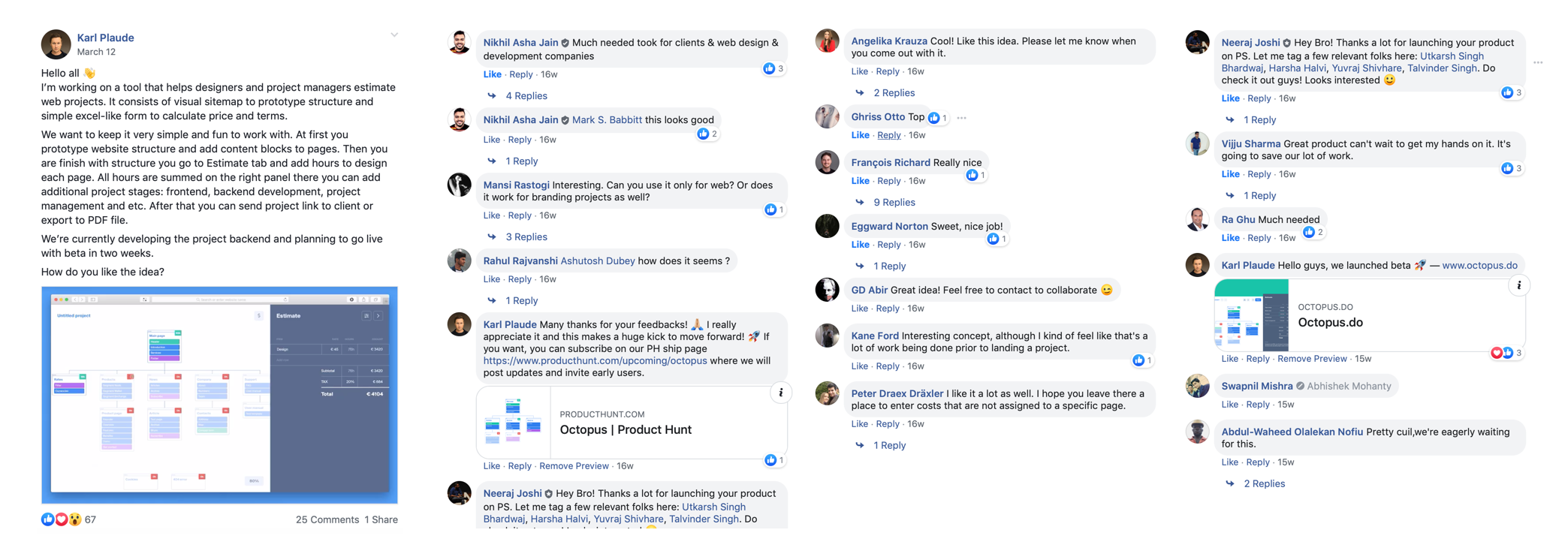
Facebook users started sharing the demo version of Octopus with friends. Some people asked to join the beta testers group. Some were even ready to pay in order to use the tool. Unfortunately, we were not ready to onboard users yet, so we created a product ship page on Producthunt to collect emails of early adopters.
We got about 100 emails and started working on the first release.
By that time, our own project managers had been testing Octopus for quite a while. The feedback from them was really upbeat. Here’s what they learnt:
In practice, Octopus allows to do estimations in half the time or even less!
MVP
We wanted to keep Octopus simple and fast and decided to stick to the essentials. We aimed to onboard the first users as soon as possible.

No landing page
The tool is minimalistic and intuitive, and there was not much to explain. So we decided to show the user a blank project right away. Such screen is easy to make sense of — one sees similar screens when launching an app on a desktop computer or a mobile phone.
No sign-up
Every new project receives a unique URL address, so the user could simply bookmark it for later access. So in the very beginning, Octopus could do without the authorization and the user profiles.
No payment
The monetization of Octopus is subscription-based: there are additional features for premium users. However, the payment module took time to develop. Also, we needed some time to deal with the legal aspect of selling our service.
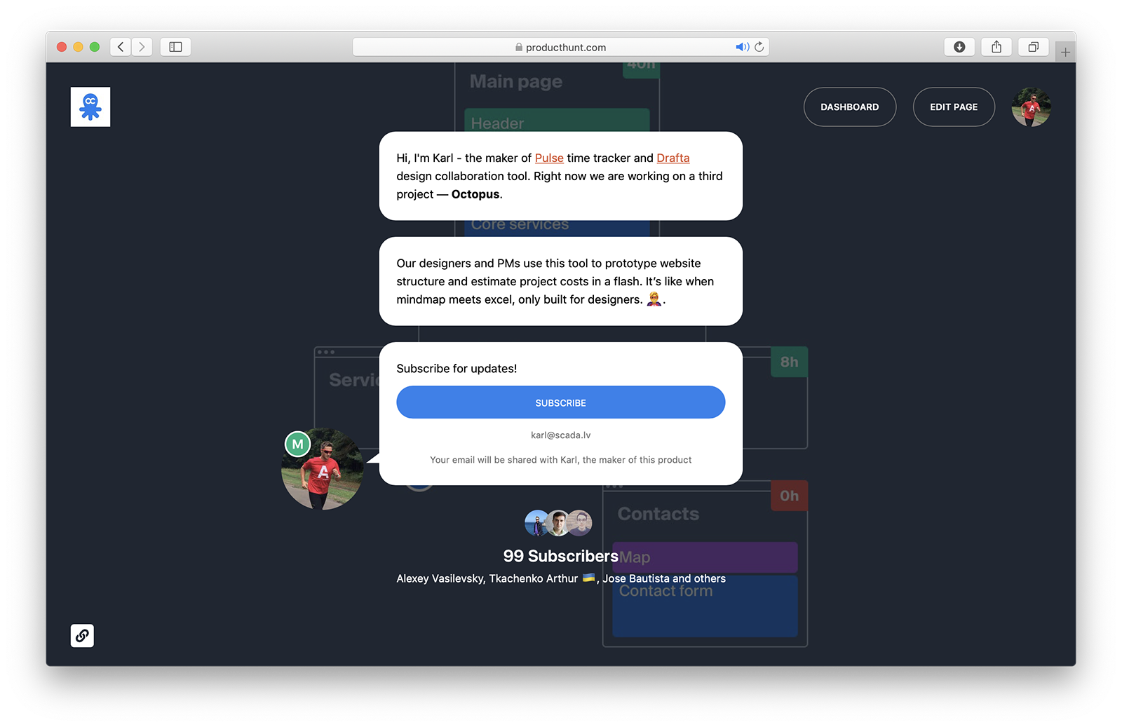
So we created a pricing page with a form where user could leave his contact details. He then proceeded to the payment form. But instead the form he saw a “Thank you” page where we promised to let him/her know when the purchase of the additional features would become available.
This move lets us monitor the amount of the users willing to pay for Octopus.
We went from the idea to the first project release in two months.
On March 20, 2019 we released our MVP and showed Octopus to our early adopters. We set up metrics and started supporting users and fixing bugs.
During the first month, we recorded 23 intents to purchase the subscription.
 alex vasilevsky
ceo
early users
We set up a Nolt board where the users can suggest features and leave their votes. This helps us to understand their needs and gather feedback about the new features.
Our previous projects taught us to use our resources cautiously and ask our audience’s opinion before developing new ideas. So we were in search of how to test features and monitor the users’ reactions. We came up with weekly emails that would communicate our ideas with GIFs.
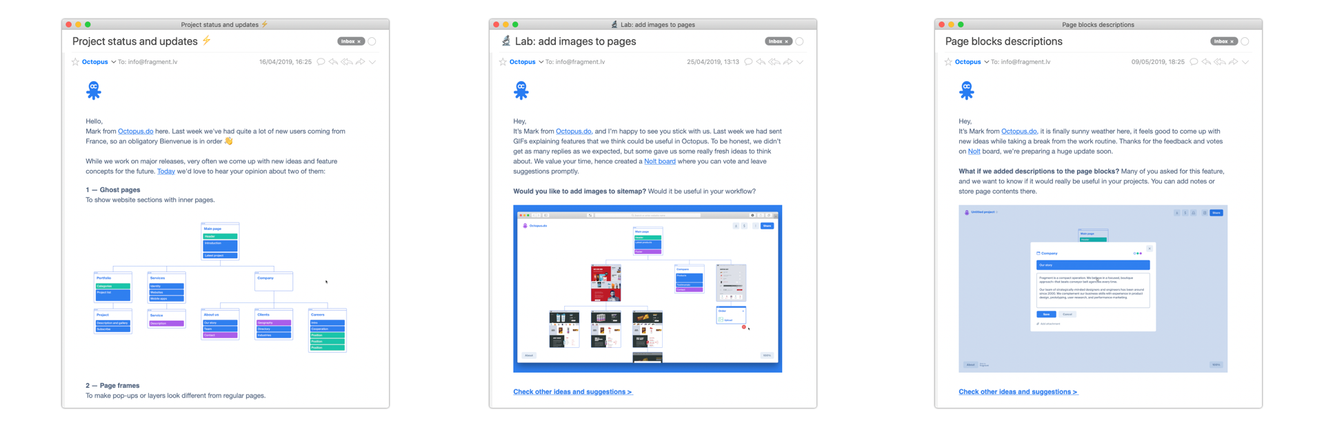
For example: would you like to add images to the sitemap? Would that be useful for your workflow?
Or maybe we should add descriptions to the page blocks? You can add notes or store page contents there.
These GIFs only take 2–3 hours to make and they provoke super-fast user feedback. They don’t have to be polished, they just convey the general idea. We highly recommend using this method before designing and developing features that might be useless for your clients.
At the same time, we were developing our core features: the signup, the possibility to save projects to the profile, and the subscription plans.
launch
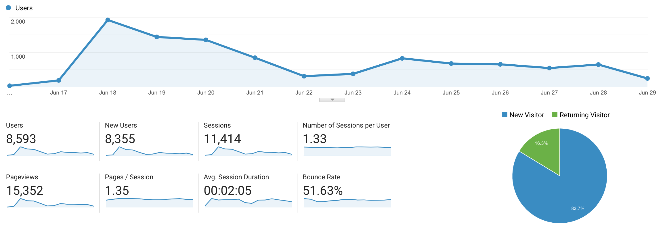
So eventually we were all set for the launch on Producthunt. We made a submission on June, 17 and the next day we were featured in the top-of-the-day list!
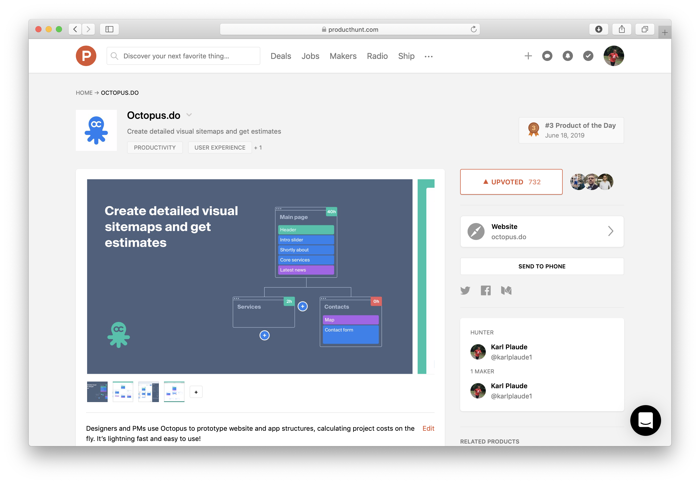

It was bad luck that Facebook announced its cryptocurrency Libra the same day and stole the spotlight. Being a ginormous project of a ginormous company, Libra quickly passed Octopus to become the most upvoted product of the day. However, we somehow managed to maintain the position on the top-3 list — boy, that day was quite a rollercoaster.
Anyway, we profited from “the Producthunt effect” and had a smooth launch. Over the first week, we got:
- 6500 users with avg 2 minutes sessions
- 510 signups
- 1800 saved projects
Octopus was mentioned on Reddit, Hacker News, Designer news, and Indie hackers. We even got some mentions on Japanese twitter :-)
Maintenance
We are now focused on developing the user-oriented features and continue to communicate with our audience. We are cautiously experimenting with new ideas, trying to use our resources carefully.
Visit — octopus.do

Get in touch with Fragment to discuss new business
hire fragmentSign up for our mailing list if you’d like to be notified on our projects and openings. No spam, promise!